Aldar
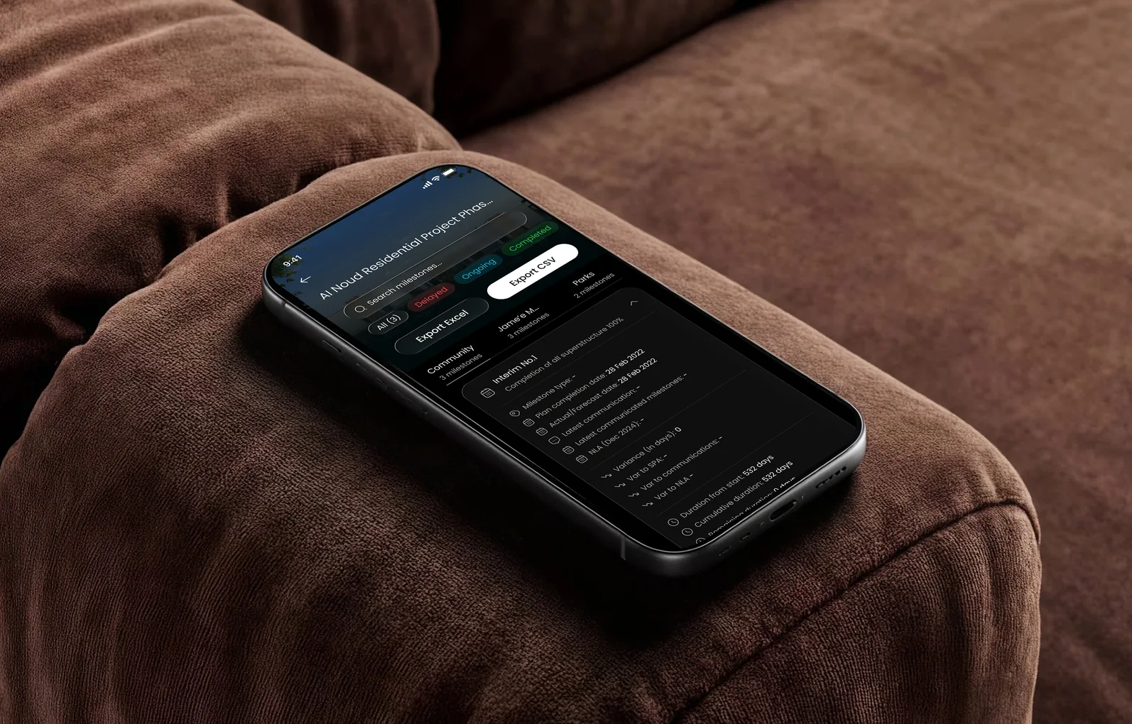
Helping investors find the number they came for, on web and mobile
- Client
- Aldar Investment, Abu Dhabi
- Industry
- Real estate · asset management
- My role
- Product designer
- Scope
- Research, IA, visual design, design system, prototyping, handoff
- Worked with
- Aldar team and development team
An AED 16 billion portfolio, one login.
Aldar Investment houses Aldar’s core asset management business: investment-grade retail, residential and commercial real estate. Its stakeholders — high-net-worth individuals and their executives — use a web portal and iOS app to track it.
I owned the product design end to end: research, information architecture, visual design, the design system, prototyping and developer handoff.
Stakeholders came to decide, not to hunt.
The portal worked but asked too much. Information was dense, navigation didn’t match how people think about a portfolio, and web and mobile had drifted apart. Finding a single figure could take far longer than it should.

Learn the product from the inside, then ask the people using it.
I sat close to the development team to learn the product inside out, audited the portal against stakeholder goals, and interviewed the people who use it. Every issue went into a UX improvement log, which I turned into a prioritised backlog so we fixed what mattered most first.
The throughline: get to the right report, project or summary in fewer steps, and make web and mobile feel like one product.

Structure around how investors think, not how data is stored.
I rebuilt the navigation around five core destinations — Portfolio, Project Details, Maps, Reports and Executive Summary — with a clearer sidebar and deliberate page hierarchy, so the most-used pages are always one decision away.

Agree the look before it scales.
I built moodboards from approved inspiration, explored two distinct visual directions on a representative page, and narrowed to one with the Aldar team — then tested layouts for dense portfolio data until it read at a glance.


Reports first, maps for place, details for comparison.
Reports are prioritised so the ones stakeholders need most surface first. Maps place projects geographically, designed for touch on mobile and precision on desktop. Project Details gives a consistent deep-dive so any two projects are easy to compare.


A first-class app, not a shrink-to-fit.
I reworked onboarding and navigation for the iOS app on the same design system as the web portal, so the two finally feel like one product.


Live reviews, validated builds.
I walked stakeholders through interactive prototypes in working sessions rather than waiting on async review, which kept us moving against tight deadlines, then supported the developers through build, checking implementation against approved designs.

30% more monthly active users.
The reworked onboarding and navigation lifted monthly active users by 30% across 10,000+ downloads. Navigation now follows how stakeholders work, dense reports are legible at a glance, and one design system serves web and mobile.
What I’d measure next: time to find a specific report, before and after — the friction stakeholders felt most.
More projects

Hiring a product designer, or untangling a complex product?
Let’s talk →