Vero
Cutting insurance onboarding from 18 minutes to 10
- Client
- Vero (business since closed)
- Industry
- Insurtech · AI
- My role
- Product designer, web app owner
- Scope
- Research, IA, wireframes, UI, design system
- Team
- Three designers, one application each
Unbiased insurance advice, without an advisor.
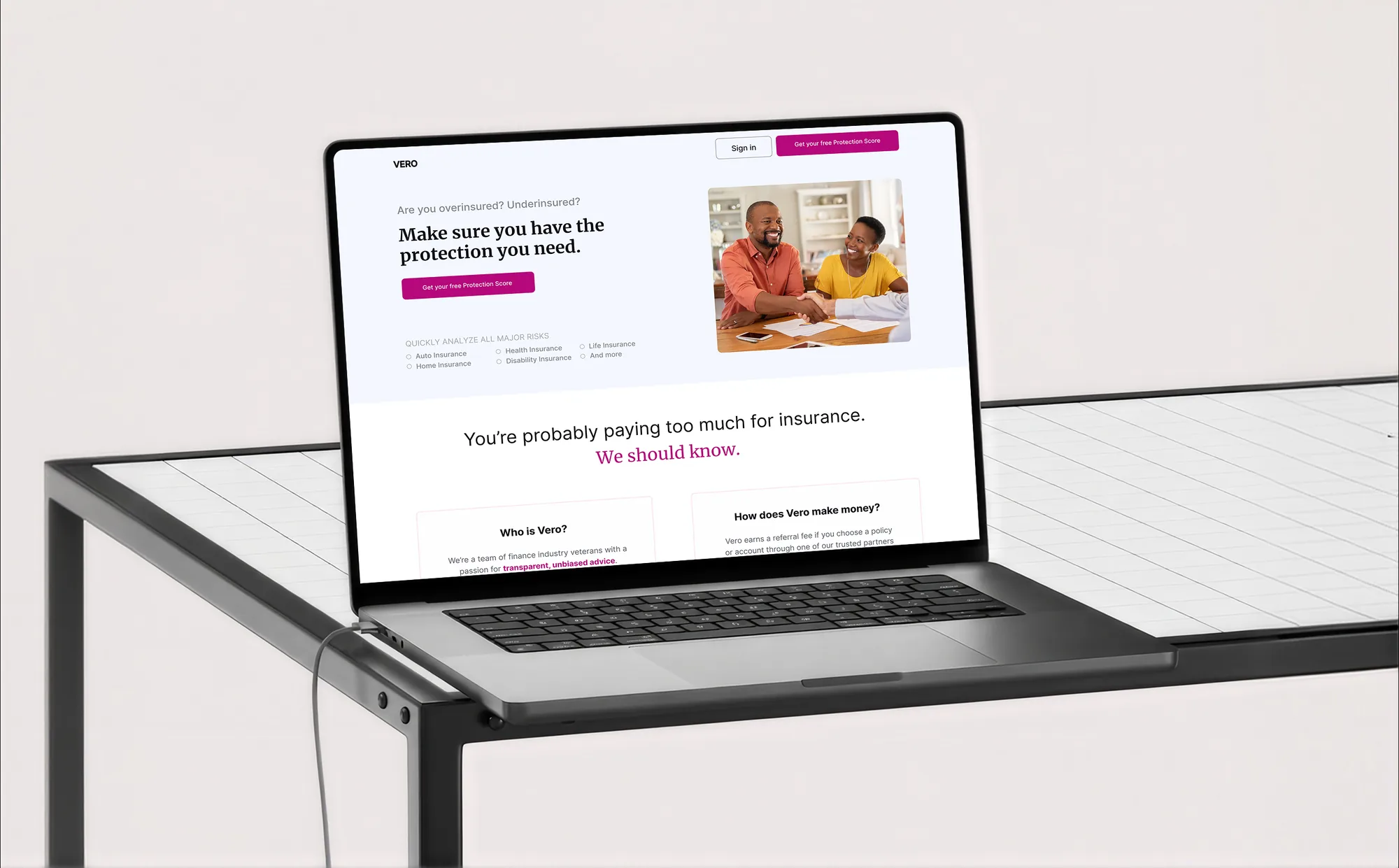
Vero paired a broad range of carriers and hand-picked agents with AI, promising transparent advice on the cover people actually need.
I was one of three designers, each owning one application. Mine was the customer web app — research, IA, wireframes and visual design — and I built the design system the whole team used.

Finding your coverage gaps took a professional.
Customers couldn’t see what they were missing without an agent walking them through it, and 400,000+ US agents spent hours on manual check-ups. The goal: automate the check-up, and cut onboarding drop-off by 40%.
Two directions. We picked the one both sides needed.
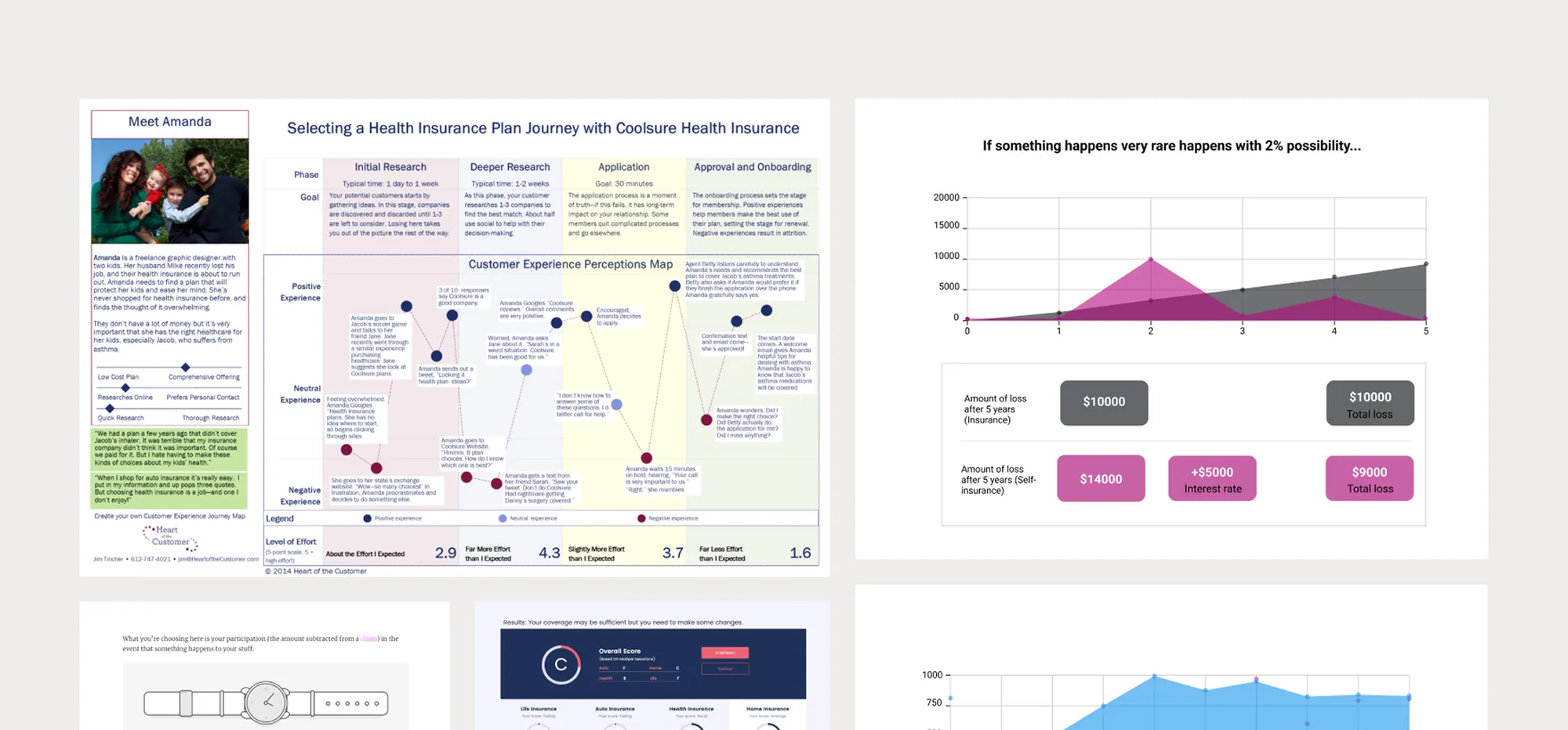
I synthesised interviews and contextual inquiries into an affinity map and a journey map, aiming at higher-order problems rather than screen-level fixes.
The findings split two ways: fix the agent’s workflow, or improve how customers understand their risk. We considered starting with the agent tool, but went customer-first — the agent’s automated review can only exist once the customer’s answers do.
Build the system before the screens multiply.
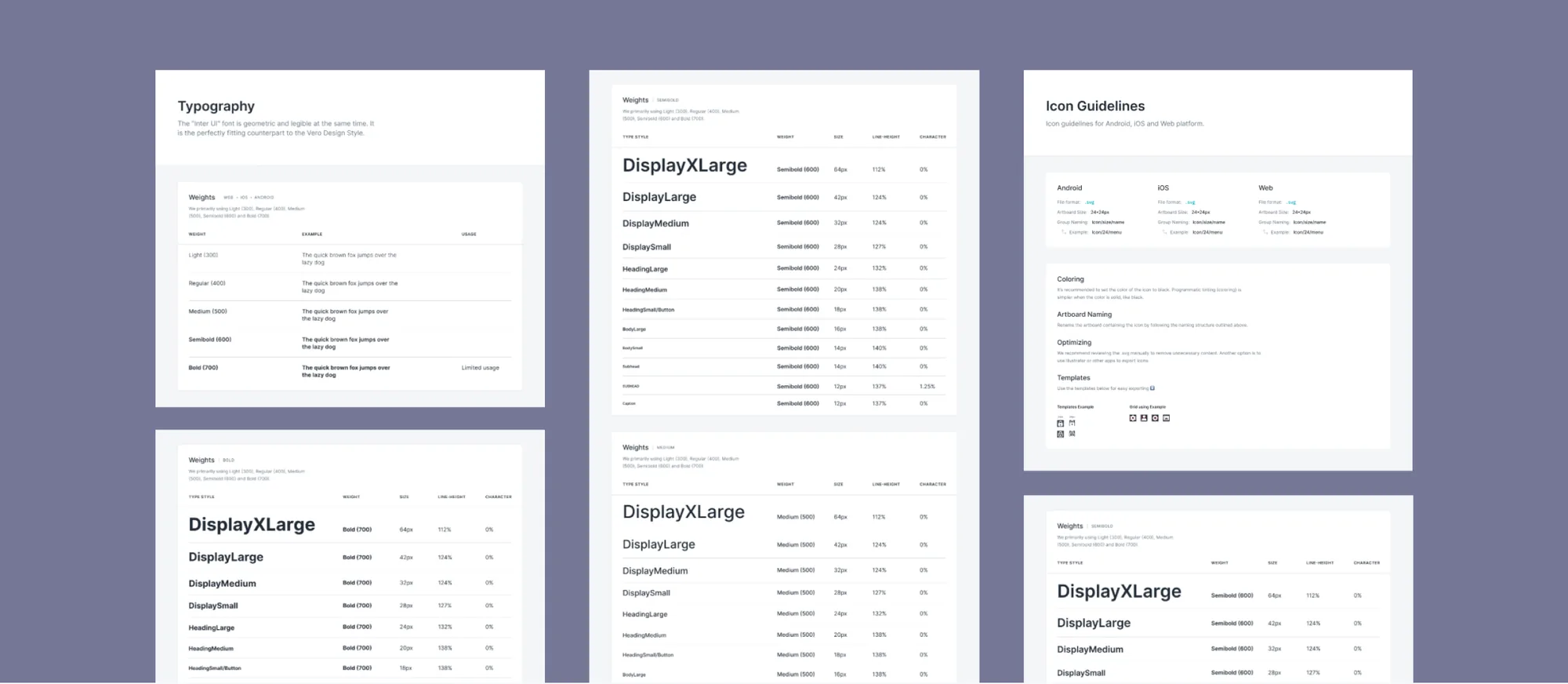
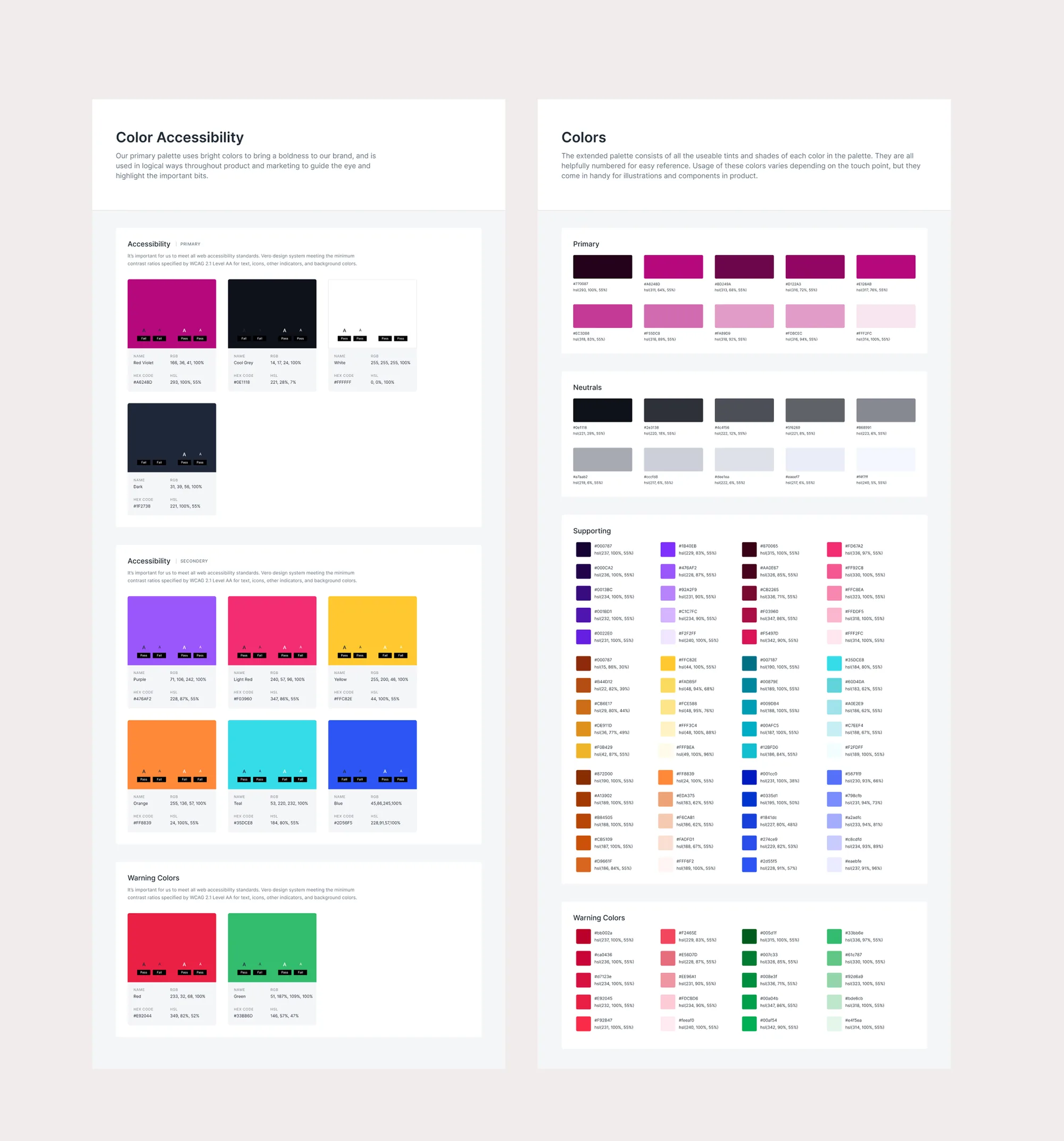
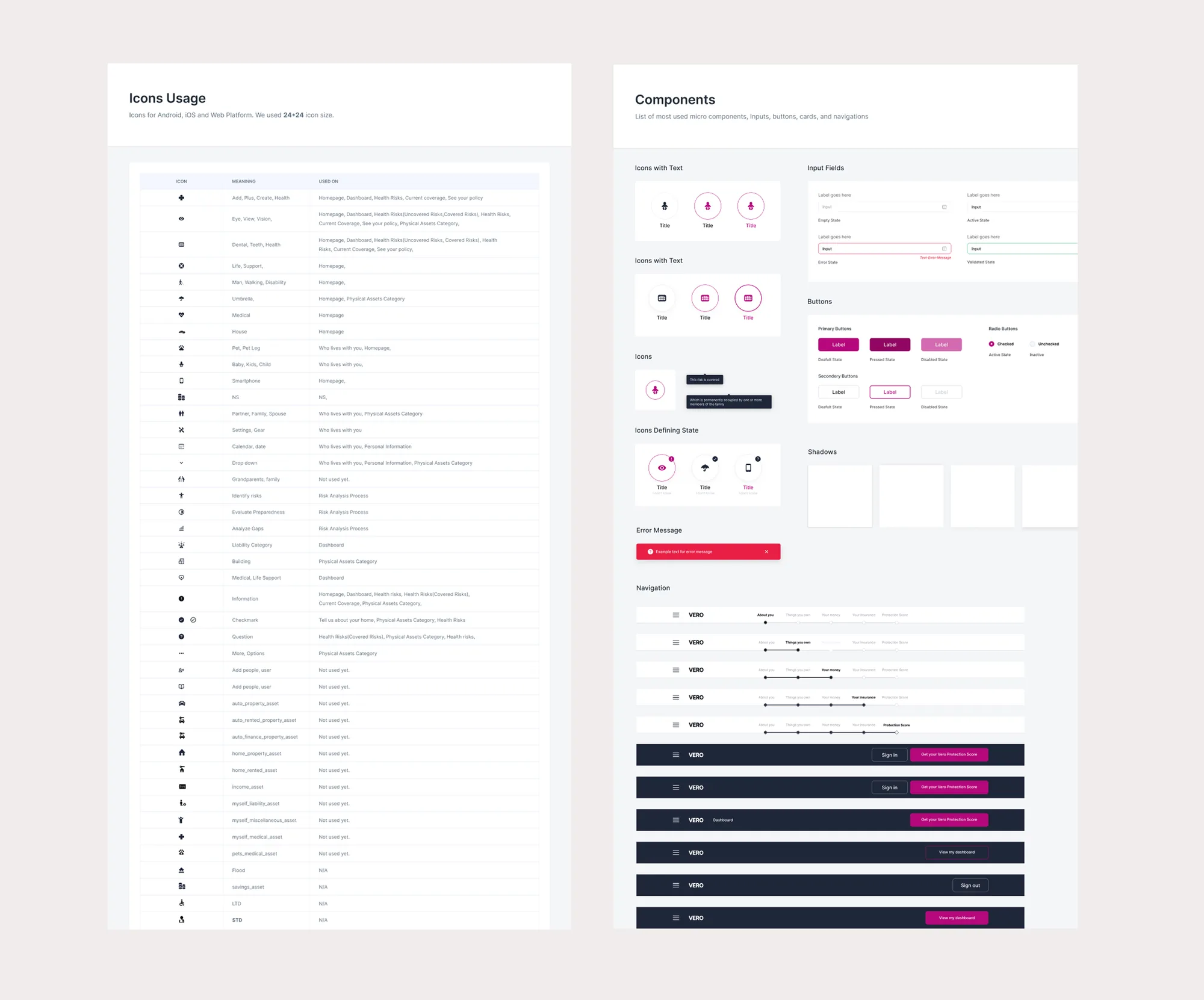
With three designers shipping in parallel, shared rules were the only way three products would feel like one company. I built the design system early, with documentation written so engineers and founders could apply patterns without asking me: colour with accessibility and warning states, icons with per-platform rules, every component state spelled out.
One number for how covered you are.
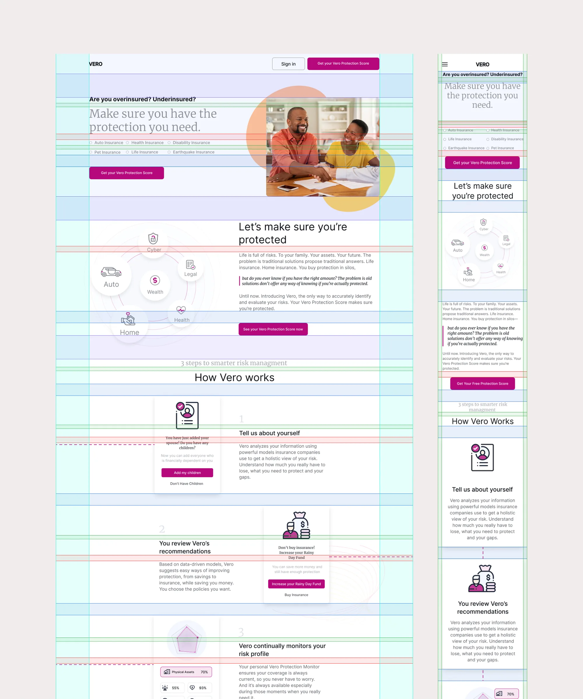
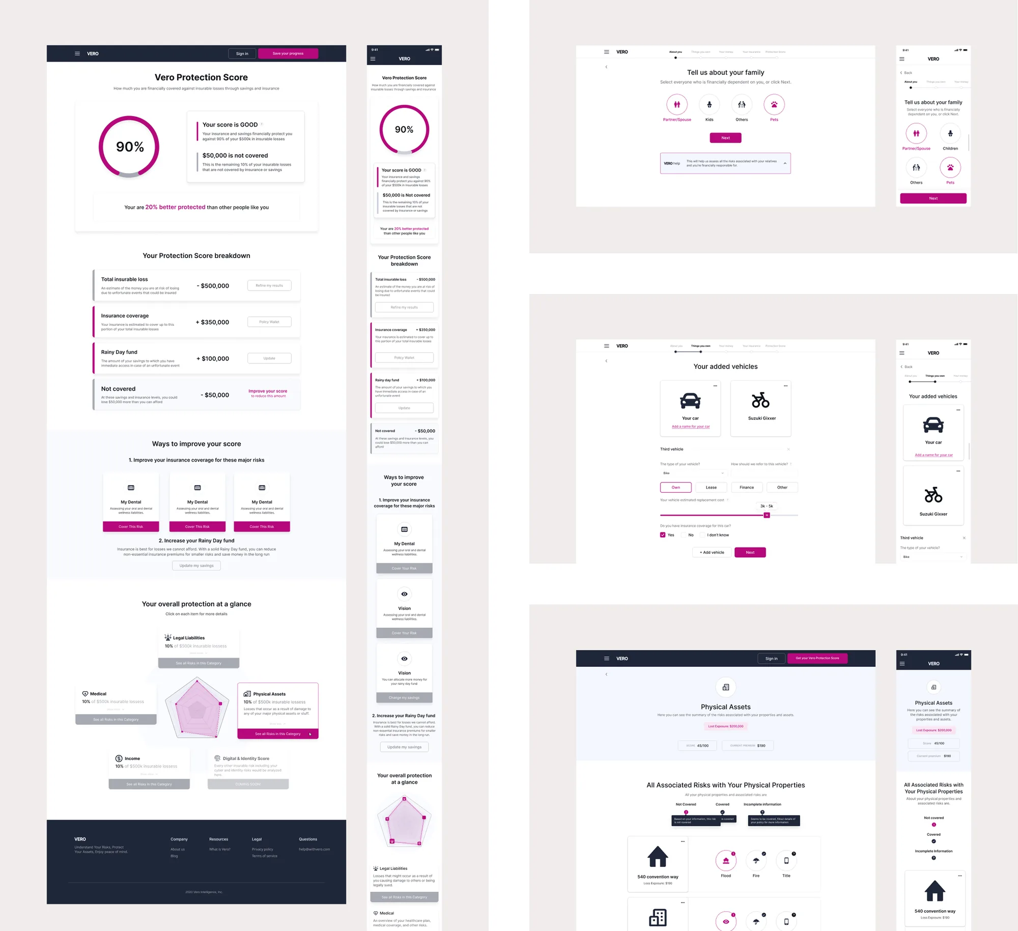
The centre of the product is the Vero Protection Score — a single number across auto, life and home, built in three steps: tell us about yourself, review recommendations, and let Vero monitor your risk.
A conversation, not a form.
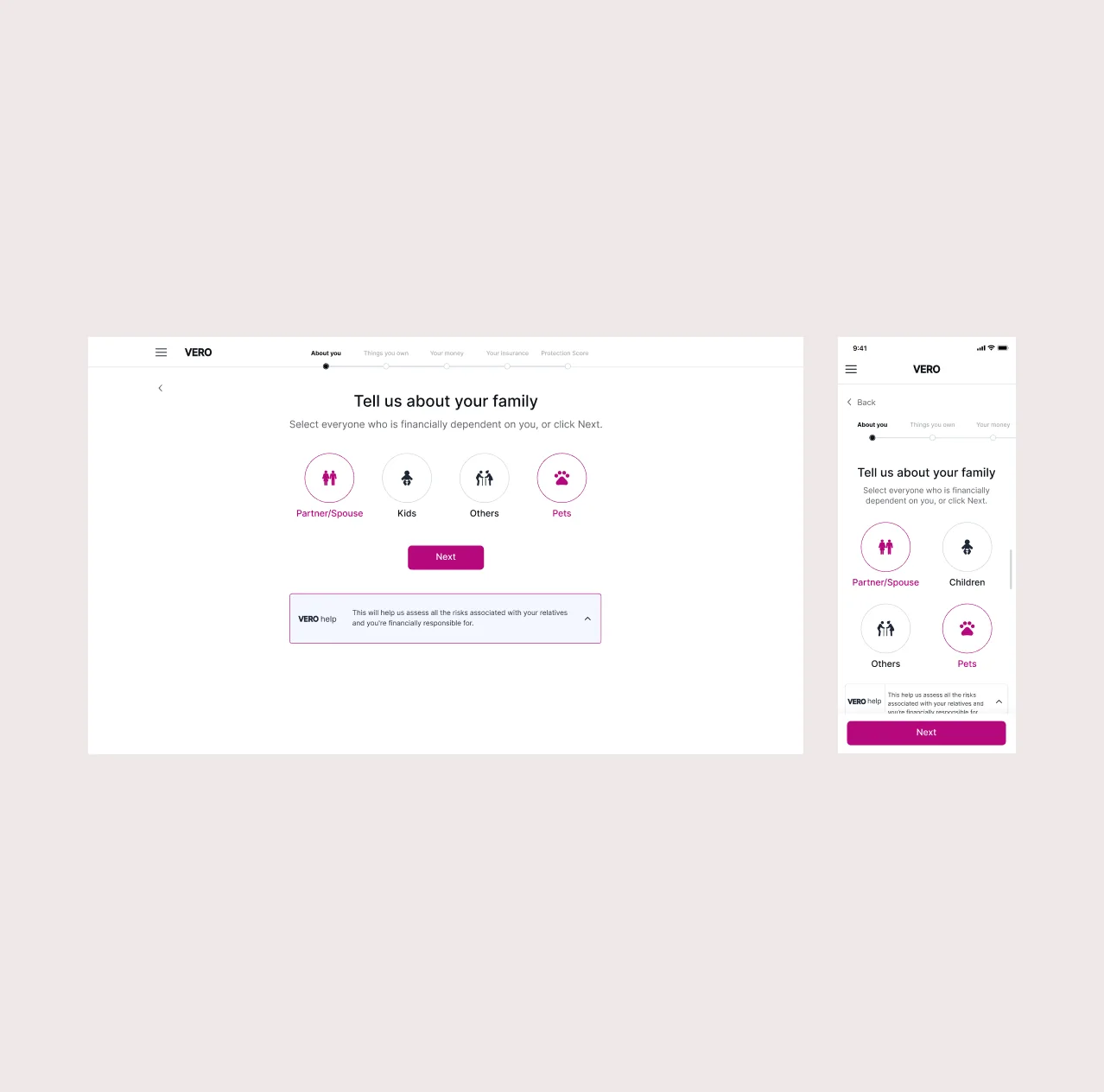
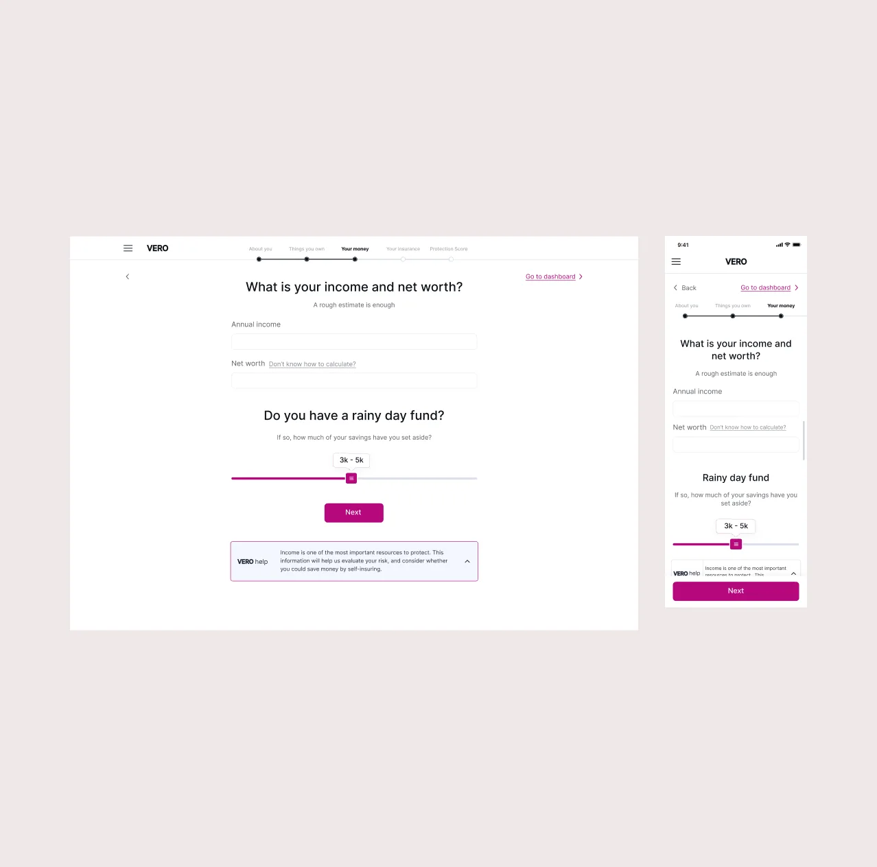
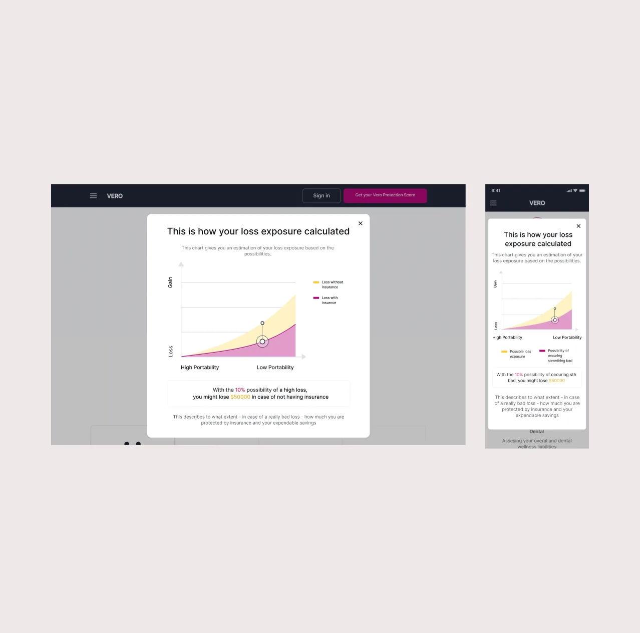
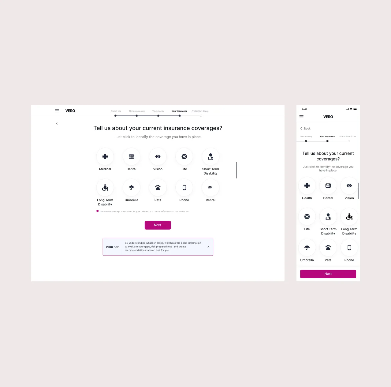
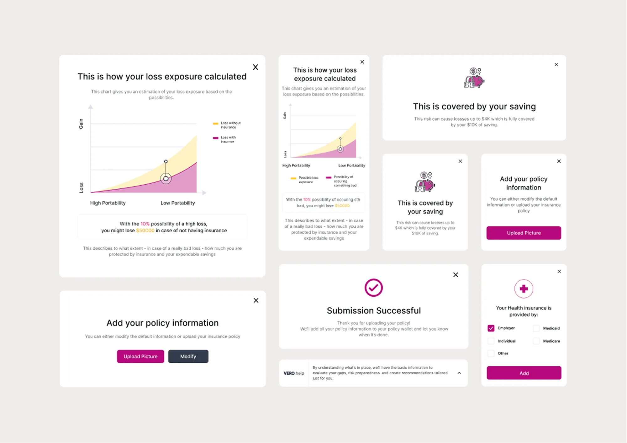
Onboarding asks one thing per screen — family, assets, current coverage, income, rainy-day fund — and says why it’s asking. Loss exposure is a chart, not a paragraph. Explainers live in dismissible modals so the main flow stays short for people who don’t need them.
Validated as it was built.
I worked alongside engineers through daily stand-ups and weekly demos, and handed over a developer-ready library — swatches, type, grids, spacing, icons, components — plus redlined Figma files and a clickable prototype.
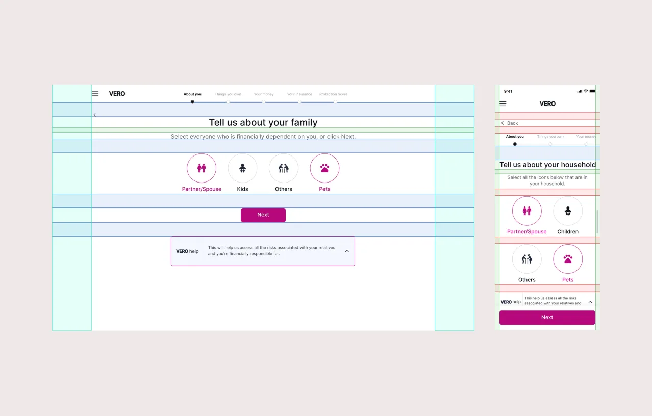
Onboarding time nearly halved.
Onboarding and plan selection dropped from 14–18 minutes to 8–10, most sharply for first-time buyers. Within 30 days of launch Vero saw an uptick across the funnel, and went on to raise a convertible note from Plug and Play Tech Center.
What I’d measure next: whether the Protection Score changes what people buy. It was designed to drive action, and that’s the outcome that would prove it.
More projects

Hiring a product designer, or untangling a complex product?
Let’s talk →