Higlobe
Making a new payments product feel safe enough to trust with your income
- Client
- Higlobe, Palo Alto
- Industry
- Fintech · cross-border payments
- My role
- Product design lead at Ofspace
- Scope
- Design system, onboarding, marketing site, pitch deck
- Worked with
- Co-founder & CEO
A US account for people paid in dollars, outside the US.
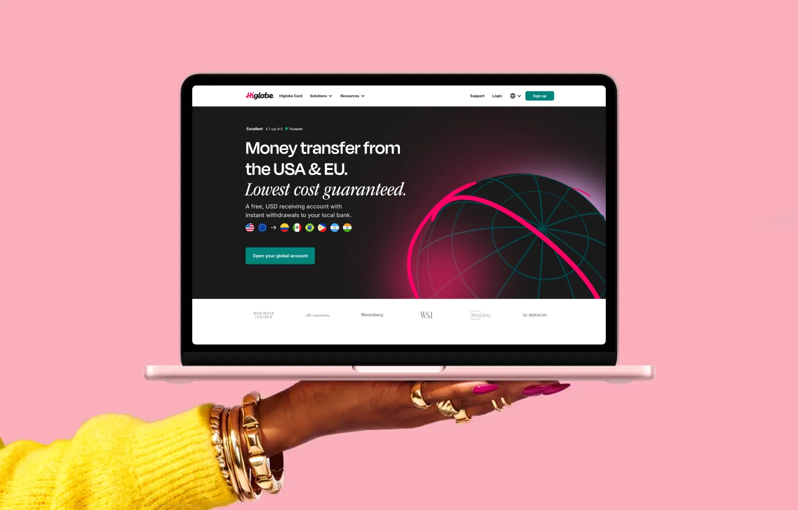
Higlobe is a Palo Alto fintech backed by $14M led by Battery Ventures. It serves freelancers and small businesses in Mexico, Brazil and the Philippines who work for US companies, and runs on stablecoin rails rather than SWIFT, which makes near-instant, flat-fee transfers possible.
I led the product design team at Ofspace, working directly with the co-founder and CEO: the design system, the onboarding and marketing experience, and the investor deck.
The promise sounded too good to be true.
An unknown company was asking people to route their entire income through technology they had never heard of, with a promise — instant and effectively free — that read like a scam’s pitch. Every screen had to earn trust before it asked for anything.
Look like a bank, not a crypto product.
Higlobe runs on stablecoins, but its users want their income to feel boring and safe. I steered the team away from the gradient-and-3D-coin language of crypto, which reads as speculative when your salary is at stake, and toward the restraint of a financial institution.
Leading with the technology would have been the easy differentiator. I chose not to: the people we were designing for care about what arrives in their account, not how it gets there.
Accessibility as a trust decision.
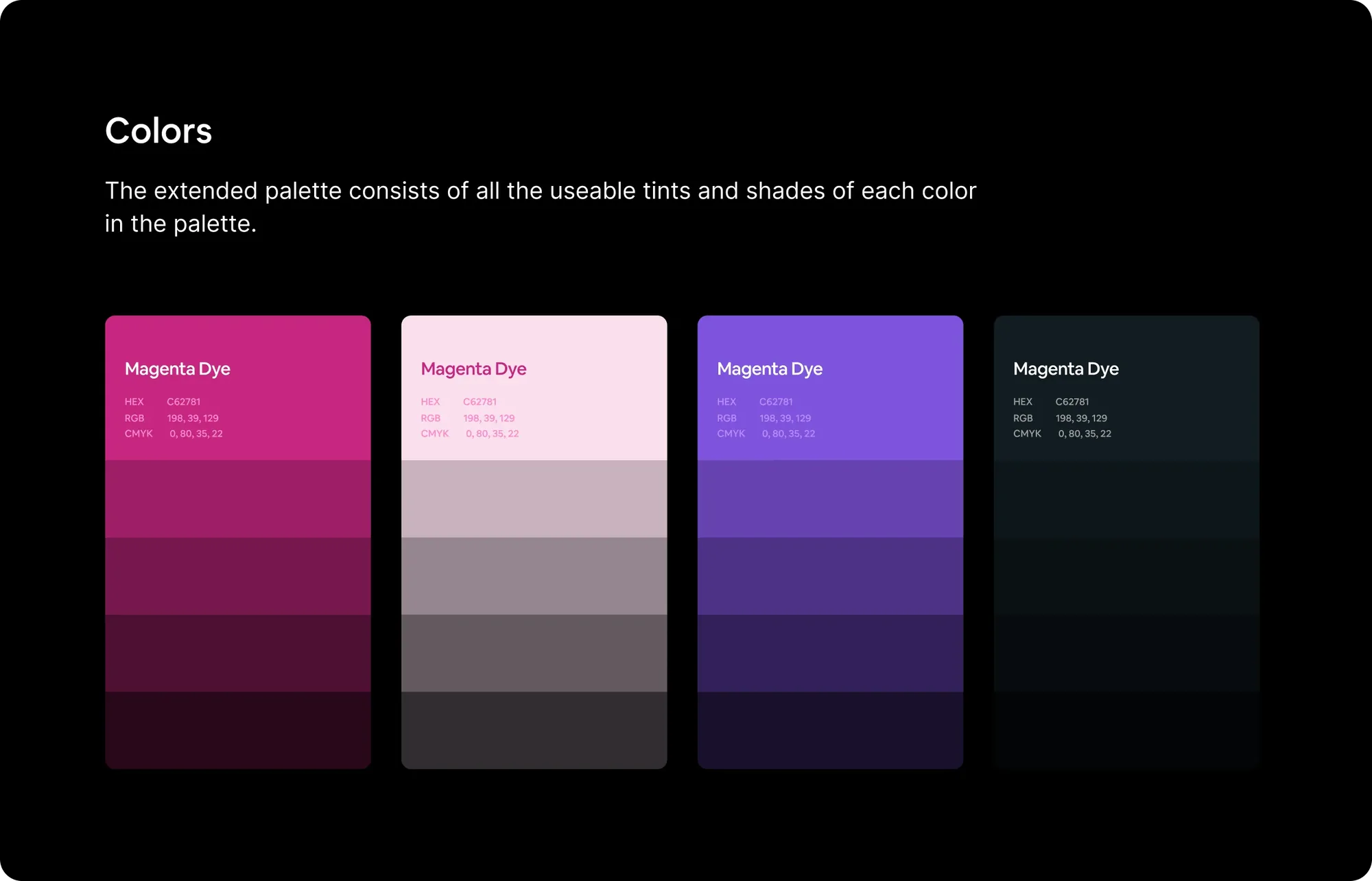
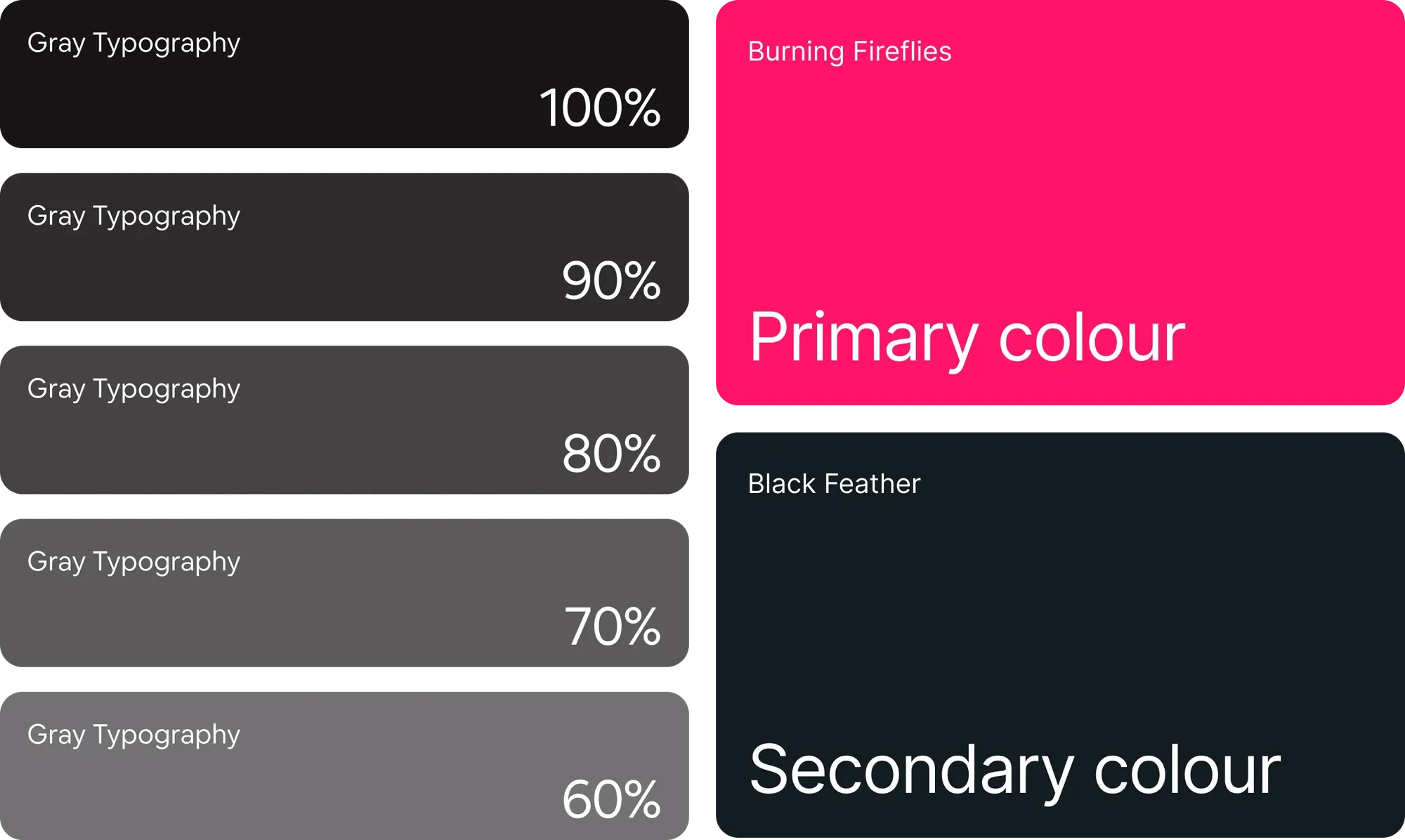
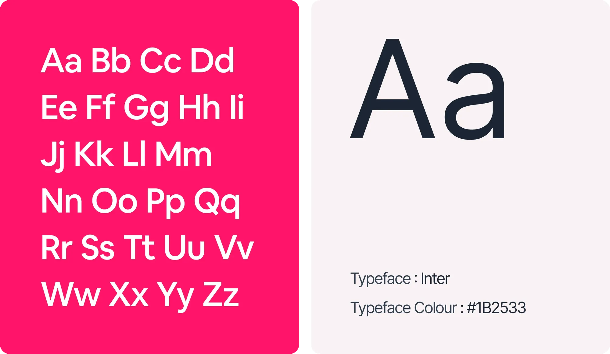
I split brand and product type — Krok for the logotype, Inter for the interface — and documented a scale from 72px to 10px with weight, line-height and tracking for every step. Every colour in the library is tested and marked at WCAG AA and AAA.
For a product whose whole argument is “you can read exactly what you’re getting”, a failing contrast ratio on a fee isn’t a compliance issue. It’s a broken promise.
Prove the savings instead of describing them.
The first thing a visitor meets is a live calculator, not a claim. Enter $1,000 and see the exact amount that arrives, the rate held for 8 hours, the saving against a bank, the expected arrival time and a total fee of $0.00.
Pricing became one sentence — the receiving account is $4 a month — and the page splits by audience so freelancers, founders and investors each find their own proof without diluting the main path into sign-up.
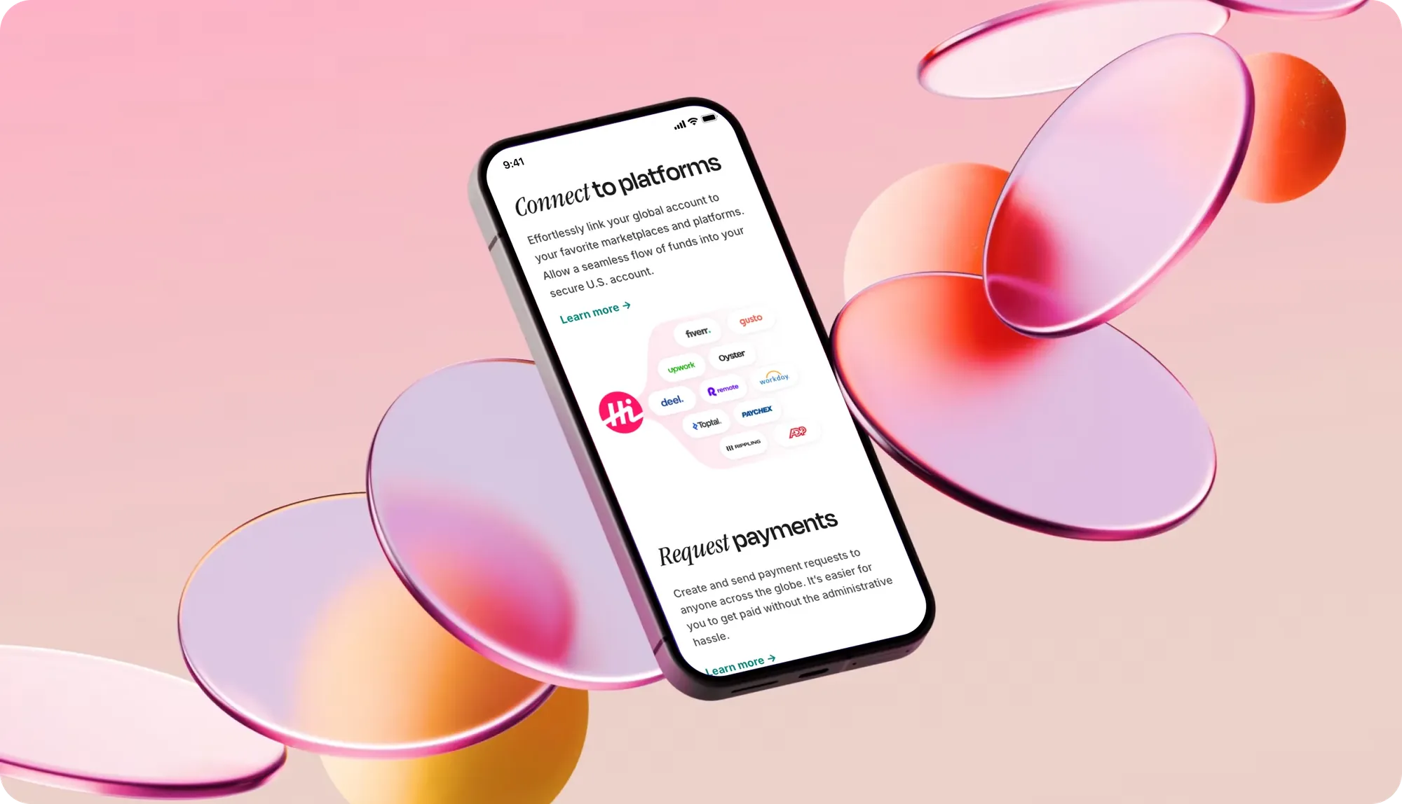
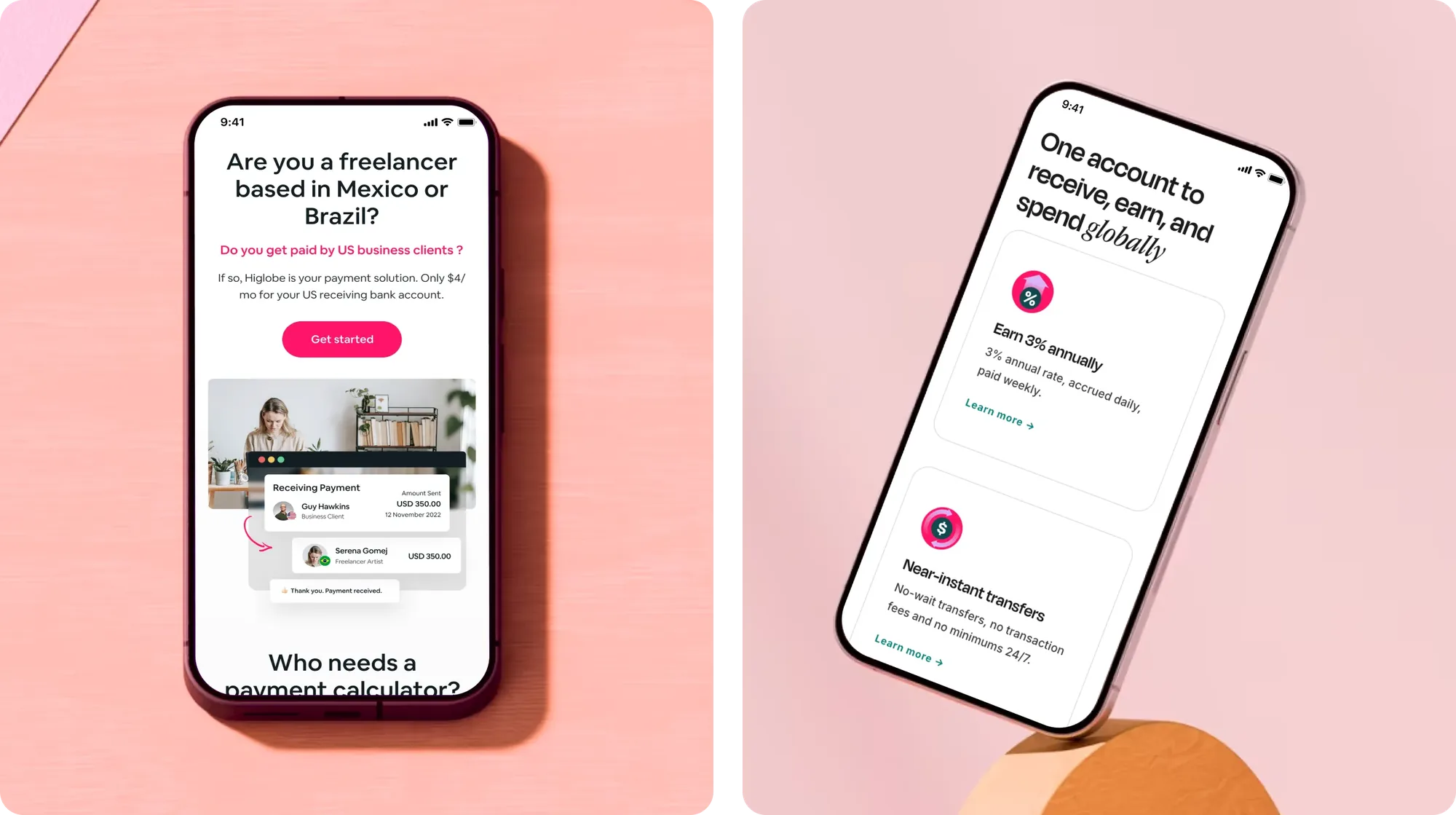
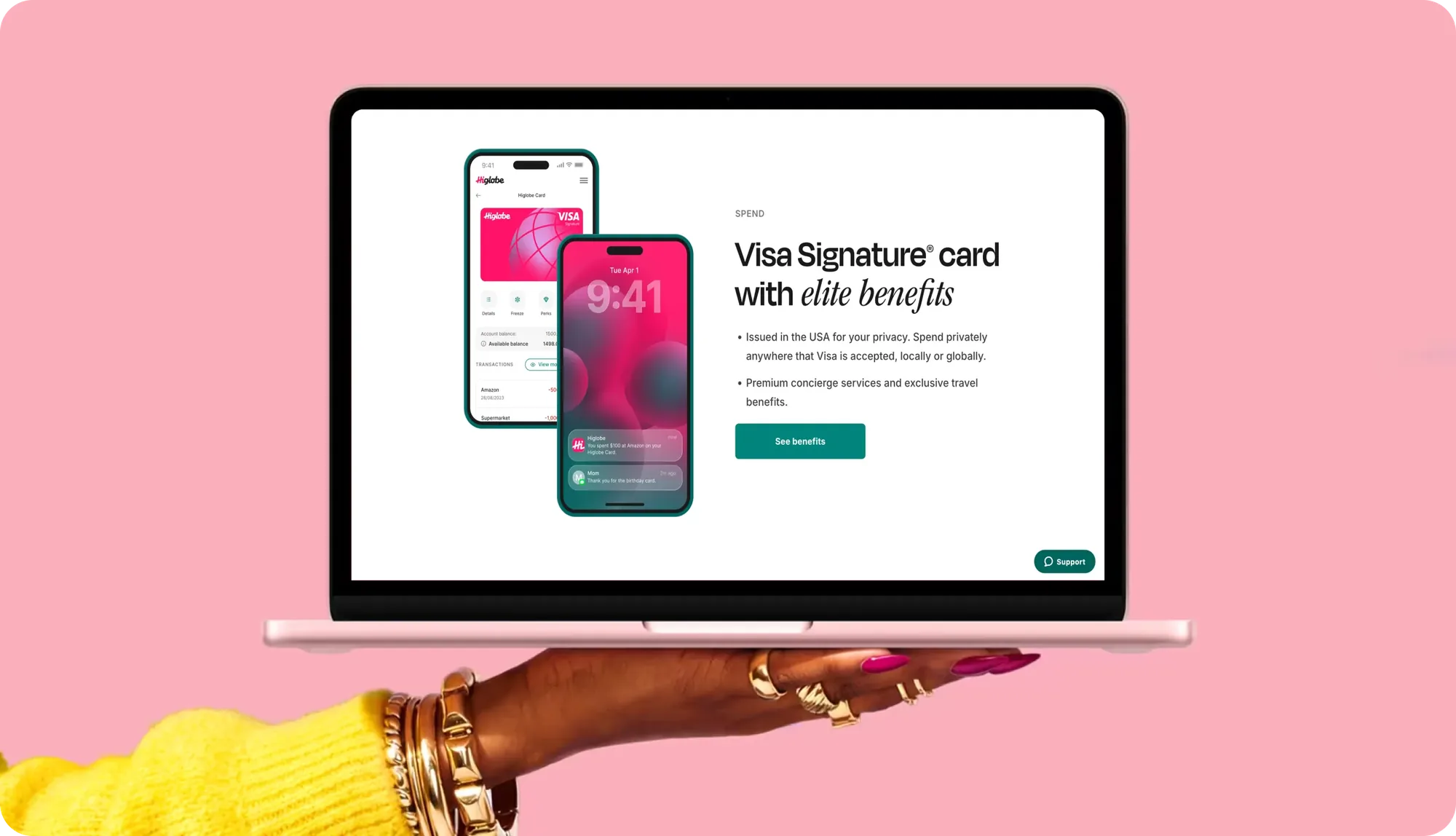
A product people were willing to try.
The redesigned onboarding lifted conversion by 2.4%. Higlobe now operates across Mexico, Brazil and the Philippines with a lowest-cost guarantee: find a cheaper way to get paid and they’ll give you $10.
What I’d measure next: how many first-time users route a second payment through Higlobe. Repeat use is the real signal that trust was earned.
More projects
Hiring a product designer, or untangling a complex product?
Let’s talk →